|
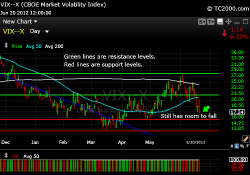
The Volatility Index ChartCurrently (except for the 1-28-2013 Chart below) all updates of my take on the VIX (Volatility Index Chart) are noted on Twitter (follow link to bottom right) and are included in the Weekly Wall Street Sun and Storm Report™. Subscribe at no cost here: Weekly Wall Street Sun and Storm Report™ Market timing signals like those seen on the VIX Volatility Index Chart can be very helpful in determining or confirming the stock market's direction. To get the latest post, please refresh the page. 2-07-2013: The VIX is just above "my number"! This favors the Bears. The most recent chart is at this link: 1-28-2013: The VIX is Moving Up! The most recent chart is at this link: 6-20-2012: The VIX is Falling Once Again! The VIX should have shot UP today, not down if this market was serious about selling off. It is not yet decided, but this gives Bulls the edge perhaps before a pullback begins in earnest. I believe the first red line may hold the fall of the volatility index, so you'll at least want to pay attention to whether it hesitates there or slices straight through. If the latter occurs, the Bulls will have more upside action to enjoy.
Standard Disclaimer: It's your money and your decision as to how to invest it. Please see my other resources page for information on my charting software, Telechart (TC2000). Could I ask a favor before you go? If you "liked" this post, could you "Like" it below and/or retweet it? I appreciate it.
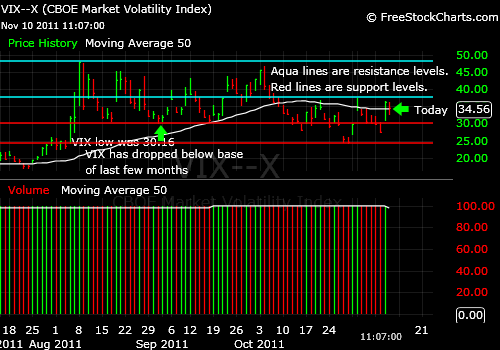
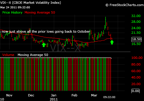
12-20-2011: The VIX is Falling! Support has been broken on the volatility index chart(VIX), first at the 50 day moving average and then today it broke below 24.44 for the second time. Yes, last Friday it looked like the VIX was going to break down and then it rebounded on Friday, so we'll need another down day or two to confirm this trend. But it's definitely an improving picture for the Bulls. The SP500 Index can run up as high as 1350 or so IF it can first bust above the top line of the triangle it is forming on the daily chart. Want to see where that is? Go to the SP500Tracker™ page on the upper blue bar to the left. 11-10-2011: The VIX can come down again soon as long as it does not violate 36.87 then 37.53 to the upside. The chart below shows both resistance levels (aqua) and support levels (red). The 50 day moving average (curving white line) is also in play potentially.
CONCLUSION: The volatility index chart shows that although the VIX has reversed some progress, which was the drop below the 30.16 level, it has yet to take out the upper end of the range it has been trading in since 10-06-2011. It can still break up, yes, but it could as easily break down again. The onus is now on the Bears, not the Bulls to carry the ball to new highs. Otherwise, the stock rally will resume. Standard Disclaimer: It's your money and your decision as to how to invest it. Could I ask a favor before you go? If you "liked" this post, could you "Like" it above and/or retweet it? I appreciate it.
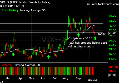
10-14-2011: Volatility Index Chart: Will the Fall of the VIX below the Prior Base Hold? The VIX is falling below the base formed over the past few months, which is very significant. Here is the Volatility Index (VIX) chart courtesy of the great system at FreeStockCharts.com at Worden Brothers:
CONCLUSION: The VIX moving below 30.16 is important, because it signals a dramatic shift in the level of fear among traders. The VIX goes up when traders buy protection for their positions, when they feel the most fear of loss. The volatility index chart says that traders believe that Europe is doing the right thing now and getting it's house in order. It supports a continued rally. Of course, there are other indicators to consider. See also my latest comment on the AAII Investor Sentiment Survey (see upper part of blue navigation bar to left).
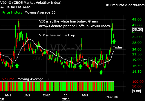
8-18-2011: The Volatility Index Chart (VIX) formed a bit of a base over the past three days and has lifted off from that level to 39.03 near the opening today (it fell back and is even higher now at 42.40!). So we now have a chance to either 1) match the prior high that hit the May 2010 high OR 2) head toward the 2008 high in the volatility index chart, which would signal extreme Bearishness. Here is the Volatility Index (VIX) chart courtesy of the great system at FreeStockCharts.com at Worden Brothers:
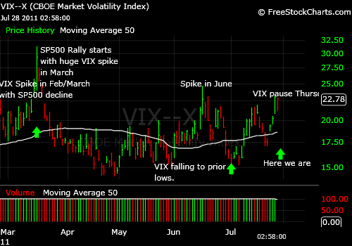
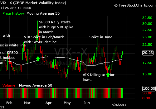
How bad will it get? That all depends on the willingness of the stubborn European politicians to either split up the European Union which they're not going to do so quickly or take their financial medicine, which they also seem reluctant to do. To date, Europe has been unable to move as swiftly as our Fed did during our 2008 financial crisis. You may disagree with the Fed's actions, but the fact is they had to act to stabilize the mess. Yes, I agree that QE2 was a complete waste of our dollar's strength and served no purpose in my opinion. This Volatility Index (VIX) opening with Europe sliding makes a revisit of the prior recent SP500 Index lows quite probable and makes visiting the July 2010 SP500 Index low quite possible with an even higher Volatility Index to match it. 8-3-2011 (SECOND UPDATE): The VIX combined with the SP500 index chart now tell a different story. The market survived a retest of the March 2011 low for the SP500 index. As long as the March 2011 low at 1249.05 holds and the VIX does not top the June high again on the volatility index chart, we can rally at least for a bit here. My initial target would be about 1305 on the SP500 Index. Remember to use a stop loss if you enter here. If support does not hold, we could drop much further. Be sure to read my blog update as well (market timing blog on blue navigation bar will take you there). Please "Like" this page and/or re-Tweet it by scrolling down a bit if you benefited from these comments. Thanks very much! 8-3-2011: The VIX is now hovering just BELOW the June low, so it has further to go and so does the sell-off. My target is unchanged - March high at a minimum. When stocks are falling but fear is not maxing out, there is more selling to be done. 7-29-2011: VIX is now above the June high (see charts below). My target is the March high at a minimum. 7-28-2011 Here is what the Volatility Index Chart looks like now (charting system provided by Worden Brothers at FreeStockCharts.com): The VIX is on pause today. However, the trend is up as the previous post points out. The VIX was a very good signal the other day in advance of the market decline. What it told us was that serious investors with profits were "putting protection on" to protect their gains. My feeling is that a relief rally could come before a bigger decline resumes due to a settlement in Washington, but the more fundamental problems of the slowing economy in the US and across the world as well as the European debt issues will cause this sell-off to resume. Please "Like this"/ReTweet it below the chart if you appreciate this information. Thanks very much. 7-26-2011: The VIX is spiking again. This chart supports the notion that another sell-off has begun. Here is what the Volatility Index Chart looks like on 7-26-2011 (charting system provided by Worden Brothers at FreeStockCharts.com): Look to the far right. You see how the VIX is starting to rise again? My target for this move is the March high. It could stop at a lower level, but that is my current target. Read the next post and look at the charts to see what happened back in March. To see where SP500 index support is, please click on the SP500Tracker™ Button on the blue bar to the UPPER left. And if you "liked" this chart, could you "Like" it below and/or retweet it? Thanks very much.
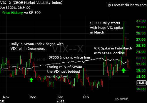
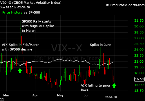
6-30-2011: The VIX did spike above the 20ish level referred to in my last post and the markets have rallied after a lower high was formed. Look back at the drop in the VIX as the market rose in the Dec. 2010 to Feb 2011 period. The VIX fell only in the first couple of market weeks and then just bobbed up and down, never spiking very high except for what was probably a swoon at the end of January which probably was anticipating the much deeper decline in March. Here is what the Volatility Index Chart looked like then (provided by Worden Brothers at FreeStockCharts.com): And here is what the VIX volatility index looks like now: The rapid decline of the VIX may limit the time period of this rally. There are certainly at least days left in it, but it could end at around an SP500 Index of 1344-1345, a range which represents the Feb.18th and June 1st highs. If you want to understand why this rally could fall short of the prior SP500 Index high, take a look at this: Market Uncertainties and be sure to sign up for my free newsletter to the right. 6-10-2011: I am not going to update the VIX chart today, but wanted to mention that the VIX needs to jump above 20.03 for this sell-off to end. The VIX is fairly well contained within a band of consolidation as if no one is yet throwing in the towel. That is bad news for the Bulls as the final bottom is NOT likely in for the SP500 index (SPX,SPY) Look at the spike in the March chart below. That is exactly the kind of spike that could end this round of selling.
03-24-2010: Let's check in on the Volatility Index Chart The VIX chart shows that the VIX is now backing off from the big spike last week and is testing the 50 day moving average noted in red in the chart below. A bounce from there seems more likely than a further break. A VIX break would bring the SP500 Index back to retest the last high but a volatility index chart bounce would lead to the next leg of the SP500 Index correction. So follow the VIX today and if it bounces, you'll know the SP500 Index correction is not over. Have a look at the volatility index chart below provided as a courtesy of Worden Brothers, Inc. at FreeStockCharts.com
Speaking of the SP500 Index, I follow it with a weekly newsletter that you can get for FREE here: Subscribe now to my FREE SP500Tracker™ Market Timing Newsletter Here
12-16-2010: Let's look at what the VIX is saying The volatility index chart shows that the VIX has just risen back above a series of market timing lows extending from October to early December. When an index rises back up above such lows, it can simply be a retest before it falls further (a retest of a breakdown in this case), OR it can be the beginning of a breakout. A VIX breakout would send the SP500 DOWN. We will now have to see which direction the VIX confirms from here on the chart. Rising would have negative market timing consequences for the SP500 index (SPY ETF) over the next few days to weeks. Tests like this can be "blips" or trend changers. But knowing this is going on and following it on the volatility index chart will be helpful to us in determining the SP500's next direction on a market timing basis. What is it doing at the open this morning? The VIX is trading right around the 17.90 level on the volatility index chart at 10:18 am ET, which was the October low. Now we have to see if it can FALL below the other lows which were 17.83 and 17.86 in November 2010 or whether it will just rise cleanly above 17.90. If the latter happens, expect a sell-off in the SP500. 2:55 pm: The VIX Is now challenging the lows of the past few trading days. A breakout would help the SP500 rally further. Since 2:15 pm the VIX has been climbing, so this is not over. Stay tuned. 8:01 pm: The VIX did NOT close at a new closing low although it made the attempt. It closed at 17.39 which is not far from the 17.90 number it was flirting with earlier today. Remember: VIX UP, SP500 DOWN. VIX DOWN, SP500 UP. If the VIX can break to new lows and CLOSE there, this rally in the SP500 will find new legs. Please note that the chart below is from this AM and the close was BELOW, not above the WHITE LINE.
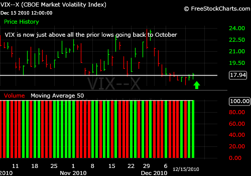
Chart courtesy of Worden Brothers, Inc. at FreeStockCharts.com.
Subscribe to my FREE SP500Tracker™ Market Timing Newsletter Here
Subscribe to Free "Tips" and SP500Tracker™ Newsletter Here
9-24-2010: Let's look at what the VIX is saying
CONCLUSION: The VIX chart is STILL supportive of a SELL-OFF in stocks.
A breach of 21.42 would likely invalidate the idea that the market could still break down from here and reverse through the support level of 1131.23 on the S&P 500. That is the market timing view of the VIX.
|